System Design workspace tour
Understand the toolbar, editor, canvas, inspector, and everyday navigation.
AAL System Design 0.2 · Dictionary 0.2.0
Toolbar and panels
The toolbar groups actions by task. For the Orders flow, start with Add to create boxes, then use View to open the panels you need.
Find an action
| Control | Use it to |
|---|---|
| Project | Navigate, rename, transfer projects, or open documentation. |
| Undo / History | Undo or redo supported changes. |
| Auto Layout | Arrange customers, entry paths, and cloud/on-premises groups automatically. System Design has no global direction setting. |
| View | Show panels, response lines, telemetry, memberships, the legend, and visual preferences. |
On a smaller screen
- Below 1024px, Present and labeled Save remain directly available; secondary actions move into More.
- Source and Inspector begin closed and open one at a time as overlays. Selecting an object does not open Inspector automatically.
- Closing a panel preserves edits. Returning to desktop width restores prior panel visibility. Use the collapsed source tab to reopen the editor and its divider to resize it.
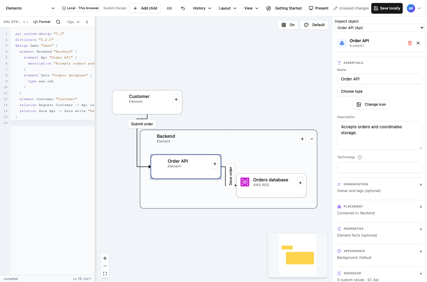
- Add element or Add child creates immediately; Connect elements is a separate action.
- Source remains the semantic truth; invalid edits keep the last valid canvas visible.
- The inspector groups essentials, properties, placement, and appearance using section icons.
Select the screenshot to inspect it at full size.
Source editor and diagnostics
The source editor describes the same Orders flow in AAL. It provides line numbers, highlighting, indentation, element completion, and formatting.
Try a small source edit
- Find the Orders API element declaration.
- Change its quoted display name, keeping its ID unchanged.
- Check diagnostics and look for the updated label on the canvas.
Canvas navigation and selection
Use the canvas to follow Customer → Orders API and arrange the flow for your reader.
Navigate and select
| Gesture or control | Result |
|---|---|
| Right-drag | Pan the canvas. |
| Fit view | See an overview. New diagrams initially open at a readable entry zoom. |
| Drag empty canvas | Select objects. If the rectangle intersects connector paths, connectors take priority, including manually routed bends. |
| Shift/Ctrl/Cmd-click | Add or remove boxes or connectors from selection. |
| Click empty canvas | Clear selection. |
| Select one connector | Show its routing handles and full label. |
Read and style a selection
- Boxes, connectors, and labels have distinct group styling controls.
- Shortened labels and numbered markers reveal complete text in Designer and Presenter. Labels remain independently draggable.
- Opening panels or changing visibility preserves the camera and element positions.
Inspector sections and validation
Select Orders API, then use Inspector to edit its name, details, or appearance. The available fields depend on the selected object.
Choose a section
| Section | Purpose |
|---|---|
| Identity | Name and object identity. |
| Details / properties | Architectural information, with typed controls for known fields. |
| Relationships | Source, destination, interaction kind, and request/response information. |
| Appearance | Visual styling. |
Rename the API
- Select Orders API and open Inspector if it is closed.
- Edit the name in Identity and commit the control. There is no general Apply button.
- Check the canvas label and source, then Save.